Vintage Scrapbook Paper Ideas and How to Use Them
Explore vintage scrapbook paper ideas and learn how to use old maps, script, florals, ledger pages, distressed textures and antique-inspired patterns in layered scrapbook projects.
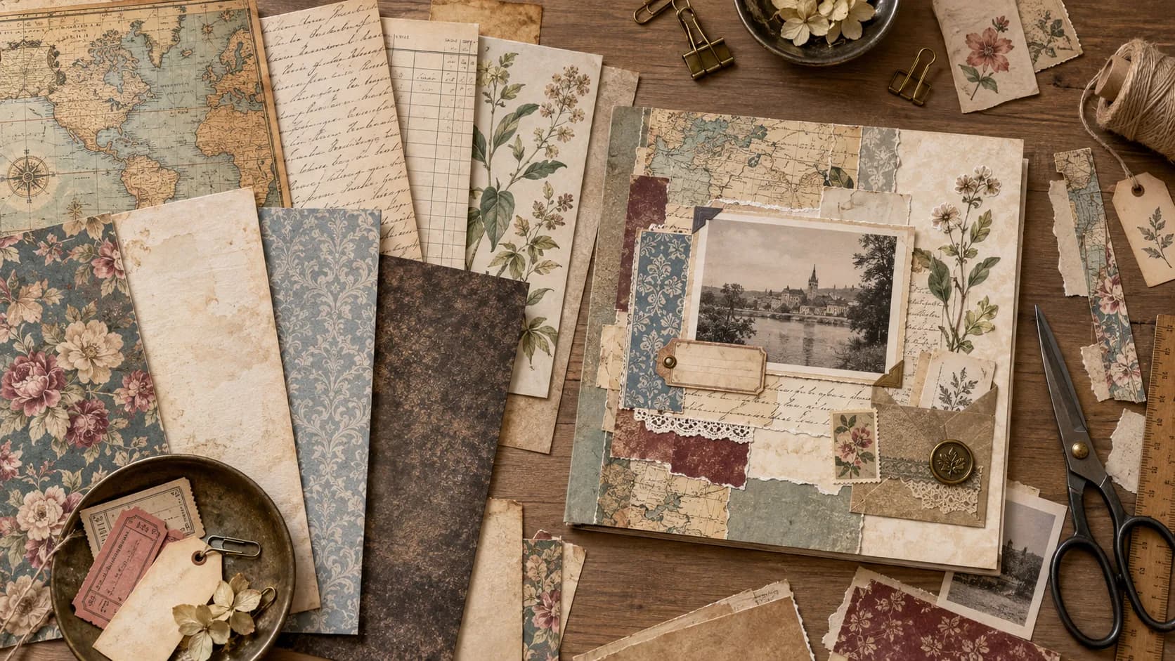
Vintage scrapbook paper can make a page feel collected rather than newly assembled. Faded writing, maps, botanical drawings, ledger lines, distressed surfaces and muted patterns create the impression that different fragments have gathered over time.
But using vintage paper well is not simply a matter of making everything brown or covering a page with old-looking textures.
The strongest vintage scrapbook layouts usually combine contrast: detailed paper with quiet paper, aged textures with clean photographs, decorative fragments with usable writing space.
This guide explores practical vintage scrapbook paper ideas and shows how to use different kinds of printable vintage paper without making every page look heavy or repetitive.
You will learn:
- which vintage paper styles are most useful,
- how to mix old maps, script, florals and distressed textures,
- how to layer several vintage papers,
- how to choose backgrounds for photographs,
- how to create aged effects without damaging your printables,
- and how to use vintage paper in scrapbook pages, junk journals, cards and memory albums.
If you want to browse complete themed collections while reading, explore the vintage scrapbook kits collection.
What Is Vintage Scrapbook Paper?
Vintage scrapbook paper is a broad visual category inspired by older printed materials, decorative styles and aged surfaces.
It can include designs based on:
- handwritten letters,
- old maps,
- ledger pages,
- book paper,
- botanical studies,
- faded florals,
- postcards,
- tickets,
- stamps,
- antique advertisements,
- damask patterns,
- leather or canvas textures,
- distressed paper,
- typewritten notes,
- technical drawings.
Some papers imitate the atmosphere of old documents. Others simply use colors, motifs or illustration styles associated with earlier periods.
Printable vintage paper gives you another advantage: the original file stays clean.
You can print one copy as-is, tear another, ink the edges of a third or use only a small section of the same design without permanently altering your source file.
Vintage Does Not Have to Mean Brown
Sepia, cream and muted brown are common in vintage design, but they are not the only option.
Vintage scrapbook pages can also use:
- dusty blue,
- faded green,
- burgundy,
- muted rose,
- ochre,
- charcoal,
- washed indigo,
- soft olive,
- aged red.
Color is often more convincing when it feels slightly softened rather than completely monochromatic.
For example, a faded blue map beside cream script paper can still feel strongly vintage without using brown everywhere.
The Most Useful Types of Vintage Scrapbook Paper
Different papers play different roles on a page.
1. Old Map Papers
Maps immediately suggest:
- travel,
- movement,
- discovery,
- distance,
- places remembered.
They work especially well for:
- travel albums,
- family history,
- expedition themes,
- journal pockets,
- photo backgrounds.
Maps are visually detailed, so they often work best when paired with a quieter paper.
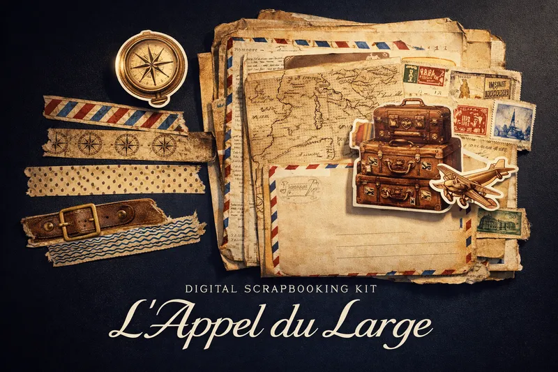
A travel-focused collection makes it easy to combine maps with tickets, labels, luggage imagery and journaling pieces without having to source every element separately.
2. Handwriting and Script Papers
Script paper can imitate:
- letters,
- diary pages,
- notes,
- manuscripts,
- old correspondence.
Use it when you want texture without introducing another large illustration.
Script is especially useful:
- behind photographs,
- in torn layers,
- under tags,
- as pocket material,
- behind botanical ephemera.
If the writing is decorative rather than meant to be read, treat it like a visual texture.
3. Ledger and Document Papers
Ledgers, forms, lists and document-inspired designs give a page more structure.
Their lines and grids are useful for:
- genealogy pages,
- date-based layouts,
- travel journals,
- inventories,
- memory keeping.
They also provide a good contrast against softer florals or watercolor illustrations.
4. Vintage Botanical Papers
Botanical imagery is one of the easiest ways to soften an archival-looking layout.
Useful motifs include:
- leaves,
- flowers,
- seeds,
- fruit,
- ferns,
- botanical sketches.
Botanicals work especially well beside:
- script,
- labels,
- old book textures,
- neutral papers.
They can make a vintage page feel natural and personal rather than purely historical.
5. Distressed and Aged Textures
A distressed paper may include:
- faded edges,
- stains,
- uneven color,
- worn surfaces,
- subtle creases,
- speckles,
- paper discoloration.
These designs add atmosphere without requiring you to physically age every sheet yourself.
Use them as quiet foundations rather than stacking several heavy distressed textures together.
6. Damask and Decorative Patterns
Decorative vintage patterns can bring elegance to a layout.
They work well for:
- family portraits,
- romantic pages,
- formal occasions,
- heritage albums,
- handmade cards.
Because damask can be visually strong, use it either as the main background or as a smaller accent rather than combining several ornate patterns at equal scale.
7. Industrial and Technical Papers
Not every vintage page needs to be floral or romantic.
Vintage-inspired papers can also use:
- patents,
- engineering drawings,
- machinery,
- blueprints,
- diagrams,
- gears,
- old technical documents.
These are useful for creating a more industrial or archival mood.
Technical drawings, maps and mechanical imagery can create a vintage scrapbook page that feels exploratory and archival rather than soft or botanical.
How to Choose a Vintage Paper for Your Photograph
Start with the photograph, not the paper.
Black-and-white photographs
These are very flexible.
Try:
- faded script,
- maps,
- botanical paper,
- muted damask,
- distressed cream.
A small amount of color in the paper can help the photograph stand out.
Warm-toned photographs
Pair them with:
- cream,
- faded green,
- muted blue,
- soft brown,
- washed floral patterns.
Avoid choosing a background that is almost identical in color to the photograph unless you intentionally want a very soft composition.
Colorful modern photographs
A quiet vintage paper can create useful contrast.
Try:
- ledger,
- neutral script,
- faded map,
- simple texture.
You do not need to make the photograph itself look old for it to work in a vintage scrapbook layout.
A Simple Formula for Mixing Vintage Papers
One of the easiest formulas is:
one quiet texture + one document paper + one decorative accent
For example:
- distressed cream background,
- torn script layer,
- small botanical paper accent.
Or:
- faded map background,
- ledger photo mat,
- narrow damask strip.
This gives the page several vintage signals without making every layer equally busy.
How to Layer Vintage Scrapbook Paper
Vintage layouts often benefit from visible layers.
The trick is creating depth without losing hierarchy.
Start with the largest surface
Choose one main paper.
This can be:
- map,
- script,
- faded texture,
- subtle floral.
Add one contrasting paper
Use a smaller piece behind:
- a photograph,
- a journaling card,
- a title,
- a decorative cluster.
Add narrow fragments
Torn strips and small scraps can introduce:
- color,
- pattern,
- visual rhythm.
Add ephemera last
Once the paper structure works, add:
- tickets,
- labels,
- stamps,
- tags,
- small illustrations.
This stops ephemera from becoming a substitute for composition.
If you want to work more specifically with these smaller elements, read Junk Journal Printables: What to Print and How to Use Them.
Torn Edges or Clean Cuts?
Both can work in vintage scrapbooking.
Torn edges
They create:
- softness,
- irregularity,
- visible fibers,
- a handmade feeling.
They are especially effective with:
- script paper,
- book-style paper,
- maps,
- lightweight textures.
Clean edges
They create:
- structure,
- contrast,
- more formal layouts.
Use clean cuts for:
- photographs,
- cards,
- labels,
- geometric layers,
- formal heritage pages.
Combining the two often works better than choosing only one.
How to Make Printable Vintage Paper Feel More Tactile
A digital design can become much more tactile once it is printed.
Try physical techniques such as:
- tearing edges,
- folding corners,
- layering several paper weights,
- adding stamps,
- attaching paper clips,
- using thread or ribbon,
- adding handwritten notes.
You do not need to physically distress every element.
The printable artwork already provides much of the visual aging, so physical treatments can remain subtle.
Should You Ink the Edges?
Edge inking is optional.
It can help:
- separate pale layers,
- emphasize torn edges,
- create stronger visual definition.
But it can also make every element look artificially aged if overused.
Try using it only on:
- one or two major pieces,
- tags,
- pockets,
- focal layers.
Leave some paper edges clean.
Variation usually feels more natural.
Vintage Scrapbook Paper for Junk Journals
Vintage printable paper and junk journaling naturally overlap.
You can use vintage paper for:
- signatures,
- journal pages,
- pockets,
- envelopes,
- tuck spots,
- tags,
- collage layers,
- backing pieces.
The same printable can also be cut into several roles.
For example, one map paper can become:
- part of a page background,
- a small pocket,
- a photo mat,
- two torn scraps.
That flexibility is one reason printable papers work so well for junk journals.
Library, archive and dark-academic imagery works particularly well for journal pages built from book textures, notes, labels and collected-looking paper fragments.
Vintage Scrapbook Paper for Family History
Vintage paper is a natural fit for older family photographs and genealogy projects, but the background should not compete with the people.
Try:
- ledger papers,
- subtle script,
- faded florals,
- neutral textures.
Then add:
- names,
- dates,
- places,
- short memories.
A useful layout might contain:
- one large photograph,
- one neutral vintage background,
- one smaller document paper,
- one label for the date,
- one journaling card.
You do not need elaborate decoration if the photograph already carries the story.
Vintage Scrapbook Paper for Travel Albums
Vintage travel pages work especially well when you mix different document types.
Try combining:
- map paper,
- postcard imagery,
- tickets,
- labels,
- handwriting,
- one photograph.
The page then begins to resemble a collection of travel remnants.
For more inspiration-led layouts rather than paper technique, explore 25 Vintage Junk Journal Ideas.
Vintage Paper for Cards and Invitations
Vintage papers can also provide strong backgrounds for handmade cards.
Try:
Romantic
- faded floral,
- cream,
- decorative label.
Travel
- map,
- ticket,
- small stamp motif.
Botanical
- script,
- leaves,
- muted green.
Industrial
- blueprint,
- dark neutral,
- technical illustration.
Use heavier cardstock for the structural card itself, then layer printable paper over it.
Using Vintage Paper with Modern Elements
Vintage paper does not require every other element on the page to look old.
A modern photograph can look excellent against:
- faded script,
- worn maps,
- botanical sketches,
- neutral paper textures.
You can also combine vintage paper with:
- clean typography,
- white borders,
- simple modern labels,
- minimalist layouts.
The contrast keeps the page from looking like a costume or historical reconstruction.
How Many Vintage Patterns Should You Mix?
Three is usually plenty for a single scrapbook layout.
Try:
- one main paper,
- one supporting paper,
- one small accent.
If you want more layers, repeat existing papers in different sizes instead of constantly introducing new patterns.
This creates complexity while keeping the palette coherent.
Vintage Color Palettes That Work Well
Sepia and cream
Useful for:
- archival pages,
- family history,
- old letters.
Dusty blue and parchment
Useful for:
- maps,
- travel,
- maritime themes.
Olive and faded botanical green
Useful for:
- nature journals,
- botanical pages,
- woodland themes.
Burgundy and antique rose
Useful for:
- romantic layouts,
- heritage albums,
- formal memories.
Charcoal and brass-inspired brown
Useful for:
- industrial vintage,
- machinery,
- steampunk-inspired pages.
Color should support the story rather than dictate it.
Printing Vintage Scrapbook Paper at Home
Vintage papers often contain subtle detail, especially:
- handwriting,
- thin map lines,
- stains,
- faded textures,
- botanical sketches.
Start with:
- the original high-resolution file,
- High or Best print quality,
- a paper setting that matches your physical sheet,
- a test print before a large batch.
For the complete workflow, read How to Print Digital Scrapbook Paper at Home.
What Physical Paper Works Best?
There is no single paper for every vintage project.
Lightweight matte paper
Useful for:
- junk journal layers,
- folds,
- pockets,
- torn paper.
Medium matte paper
Useful for:
- scrapbook backgrounds,
- general layering,
- printable decorative pieces.
Heavier paper
Useful for:
- tags,
- cards,
- covers,
- structural pieces.
Texture can also affect the final result.
For a detailed comparison, read Best Paper for Printable Scrapbook Kits.
Cream Paper or White Paper?
Both can work.
Cream or warm white
Can reinforce:
- parchment tones,
- sepia,
- muted botanicals,
- old-paper designs.
Clean white
Can preserve:
- clearer contrast,
- cooler vintage blues,
- fine line work,
- more accurate light areas.
Remember that the physical paper color influences the entire print.
Test both if a design depends on subtle pale tones.
Common Vintage Scrapbook Paper Mistakes
Mistake 1: Making everything brown
Fix: mix sepia with muted blue, green, rose or burgundy.
Mistake 2: Using only heavily distressed papers
Fix: introduce cleaner script, gingham, ledger or neutral surfaces for contrast.
Mistake 3: Hiding the photograph
Fix: choose a quiet background when the photograph is detailed.
Mistake 4: Using five ornate patterns at once
Fix: one dominant design, one support paper, one small accent.
Mistake 5: Aging every edge identically
Fix: leave some cuts clean and distress only selected elements.
Mistake 6: Confusing vintage with historical accuracy
Fix: treat vintage scrapbook paper as an artistic style unless a design is specifically documented as a historical reproduction.
Vintage Scrapbooking vs Vintage Junk Journaling
The two overlap, but the emphasis can differ.
Vintage scrapbooking
Often prioritizes:
- photographs,
- memory preservation,
- structured layouts,
- coordinated paper.
Vintage junk journaling
Often prioritizes:
- layered paper,
- found-material feeling,
- interactive pieces,
- writing,
- pockets and fragments.
The same printable vintage paper can work in both.
The difference comes from how you assemble the project.
How to Build a Small Vintage Paper Library
You do not need hundreds of nearly identical distressed papers.
A versatile collection might include:
- 2 quiet aged textures,
- 2 script papers,
- 2 maps,
- 2 botanical papers,
- 1 ledger,
- 1 decorative pattern,
- 1 darker texture,
- 1 unusual thematic paper.
That gives you enough variation to create very different layouts.
Complete printable kits are useful because several of these roles can already share the same palette and visual direction.
Vintage Scrapbook Paper FAQ
Conclusion: Build the Story with Contrast
Vintage scrapbook paper works best when it supports the memory instead of becoming the entire memory.
Use maps when place matters. Use script when you need quiet texture. Bring in botanicals to soften archival papers, ledgers to add structure and distressed surfaces to create depth.
Then leave enough contrast for photographs, handwriting and personal details to remain visible.
You do not need to make every element look old. A few well-chosen vintage papers are often enough to give the entire page a collected, layered character.
When you are ready to experiment, explore Pixel Scrap’s vintage scrapbook kits and choose papers that can play several different roles across your projects.