How to Print Digital Scrapbook Paper at Home: Complete Beginner Tutorial for Sharp Colors, Clean Cuts, and Beautiful Pages
Learn how to print digital scrapbook paper at home with the right printer setup, 300 DPI settings, paper sizing, borderless options, color calibration basics, troubleshooting, and junk journal printing tips.

If you have amazing digital papers but your prints look dull, blurry, or badly sized, you are not alone. Printing at home is where many creative projects succeed or fail.
This guide is a complete practical tutorial on how to print digital scrapbook paper at home. It is designed for beginners, but structured with enough technical depth to help you level up quickly. Whether you create scrapbook layouts, printable cards, tags, or junk journal inserts, the quality of your print workflow changes everything.
You will learn:
- how to set up your home printer for printable projects,
- the best printer settings for sharp results,
- paper size and scaling rules,
- borderless printing choices,
- color calibration basics,
- why 300 DPI matters,
- common print mistakes and how to fix them,
- ink and paper recommendations,
- Cricut/Silhouette compatibility tips,
- cutting guidance,
- troubleshooting and long-term storage.
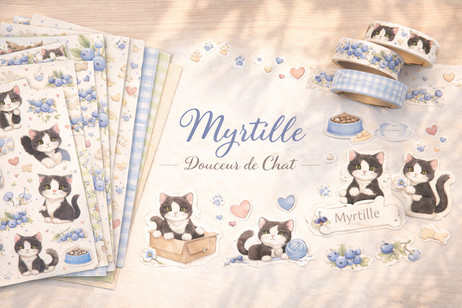
If you want to apply this instantly, keep the Pixel Scrap packs collection open while reading, pick one kit, and test each step in real time.
Why Home Printing Matters for Digital Scrapbooking
Digital kits give you flexibility and speed, but print quality decides whether your pages look handmade-premium or just “home printed.”
A strong printing workflow gives you:
- cleaner colors,
- better texture rendering,
- more accurate cut lines,
- less paper waste,
- fewer reprints,
- consistent results across projects.
For printable scrapbook paper at home, consistency is the real superpower.
Step 1: Home Printer Setup (Before You Print Anything)
Most print problems are setup problems, not file problems.
1) Confirm your printer type and condition
You can get excellent results with a mid-range inkjet printer if:
- print heads are clean,
- nozzles are unclogged,
- paper feed is stable.
Run your printer’s maintenance utility:
- nozzle check,
- alignment,
- basic head cleaning (if needed).
Do this before large print sessions.
2) Organize a “print-ready” workspace
Keep:
- paper flat and dry,
- a clean tray free of dust,
- one folder for source files,
- one folder for exported printable files,
- one notebook for settings that worked.
Document your best settings once; reuse forever.
3) Update print driver and software
Old drivers can mis-handle color profiles, borderless mode, and paper feed behavior. Update before troubleshooting everything else.
Step 2: Understand Resolution (300 DPI Explained Simply)
If you are searching how to print digital scrapbook paper, you will always see “300 DPI.” Here is what it means practically.
What is 300 DPI?
DPI = dots per inch.
300 DPI is the quality standard for most craft printing because it preserves detail, gradients, and texture.
Why 300 DPI matters in scrap and junk journals
At low resolution, you may get:
- fuzzy text,
- muddy watercolor transitions,
- jagged edges on labels,
- weak vintage texture definition.
At 300 DPI, papers look cleaner, cuts look sharper, and layering feels more professional.
Quick rule
For final print files:
- 300 DPI = standard quality,
- 150 DPI = usually too soft for detail-heavy craft use,
- 600 DPI print mode can help micro text, but file quality still starts at 300 DPI.
Step 3: Best Printer Settings for Printable Scrapbook Paper
Correct settings are the biggest quality lever.
Core settings checklist
- Print quality: High / Best
- Scale: 100% (disable fit-to-page)
- Paper type: match your actual paper
- Color mode: full color (avoid draft mode)
- Output profile: photo paper profile only when using photo media
If your labels or tags print at the wrong size, scale is usually the issue.
Recommended baseline by project
| Project Type | Quality | Paper Profile | Borderless | |---|---|---|---| | Full-page printable scrapbook paper | High | Matte photo / heavy matte | Optional | | Junk journal ephemera sheets | High | Matte paper | Usually off | | Tags/cards | Best | Heavy matte / cardstock profile | Off | | Decorative full-bleed backgrounds | High | Matching media | On (if needed) |
Step 4: Paper Sizing and Layout Logic
Paper size mismatches create invisible scaling errors that ruin cutting compatibility.
Common sizes
- US Letter: 8.5 x 11 in
- A4: 210 x 297 mm
- 12 x 12 in (classic scrapbook size)
Always check both:
- document size,
- printer paper size setting.
If one is A4 and the other is Letter, your print will shift or scale.
Export workflow tip
When possible, export dedicated print sheets in the same final size you physically load in the printer. Do not rely on auto-fit.
Step 5: Borderless Printing — When to Use It (and When Not)
Borderless mode is useful but not always ideal.
Use borderless when:
- you need full-bleed backgrounds,
- no white margins are acceptable,
- the design is intended to be trimmed edge-to-edge.
Avoid borderless when:
- precise sizing is needed for cut templates,
- your printer slightly expands borderless prints,
- you print journals/cards with intentional margins.
Borderless caution
Some printers “zoom” by default in borderless mode. Test with a measurement square first.
Step 6: Color Calibration Basics (No Advanced Gear Required)
You do not need expensive calibration hardware to improve color fidelity significantly.
Beginner color calibration approach
- Print a small test chart on your target paper.
- Check skin tones, neutrals, and shadows.
- Adjust brightness/saturation modestly in software.
- Save as a reusable print preset.
Practical color goals for scrapbook/journal use
- Avoid crushed dark areas (you lose texture),
- keep off-whites warm (for vintage mood),
- preserve subtle tonal transitions (watercolor styles).
If your printed pages consistently look too dark, reduce output contrast slightly before printing final sheets.
Floral and watercolor kits are perfect for calibration tests because gradient quality is easy to judge.
Step 7: Printable Workflow (From Download to Finished Sheet)
Use this repeatable process for clean production.
Printable workflow in 10 steps
- Choose one kit/theme.
- Select only pages needed for this project.
- Confirm file resolution (target 300 DPI).
- Match document size to paper size.
- Choose paper stock and load correctly.
- Apply saved printer preset.
- Print one test sheet on regular paper.
- Validate size, crop, color, readability.
- Print final sheets on premium paper.
- Let ink dry fully before cutting/stacking.
This single workflow prevents most waste and quality frustration.
Ink Recommendations for Home Craft Printing
Ink strategy affects both budget and quality.
Dye ink vs pigment ink (quick view)
| Ink Type | Strength | Consideration | |---|---|---| | Dye ink | Vibrant color, smooth gradients | Can be less water-resistant | | Pigment ink | Better archival feel, stronger text | May look slightly less vivid on some glossy papers |
For most printable scrapbook paper at home:
- good-quality dye inks perform very well for colorful designs,
- pigment-heavy workflows are strong for archival journaling and text-heavy inserts.
Ink usage optimization
- Print only needed pages,
- use contact/test sheets,
- group print sessions by palette,
- avoid unnecessary borderless full-page tests.
Cost control comes from selection discipline, not low-quality draft mode.
Cricut / Silhouette Compatibility Tips
Many users print digital kits and then cut with Cricut or Silhouette.
Key compatibility principles
- Keep print scaling at 100%.
- Use consistent page size between design software and printer.
- Avoid borderless if registration marks are required.
- Prefer matte or lightly satin papers for cleaner sensor reading.
For sticker sheets
- Print a calibration test first,
- ensure registration marks are not clipped,
- let ink dry before loading on mat.
Material handling tip
Heavier cardstock may require blade/depth adjustments. Test one small shape before full-sheet cutting.
Cutting Tips for Cleaner Results (Manual + Machine)
Printing and cutting quality are linked. A beautiful print can still look weak if cuts are rough.
Manual cutting tips
- Rough-cut large regions first, detail-cut later.
- Use sharp precision scissors for curves.
- Use a craft knife and mat for straight edges.
- Rotate paper, not your wrist, on tight curves.
Machine cutting tips
- Use proper material setting,
- test cut before full run,
- clean mat regularly,
- replace dull blades early.
Character-rich kits are ideal for practicing mixed cutting styles: broad motif cuts + tiny label precision.
Common Print Mistakes (and Fast Fixes)
Mistake 1: Using “fit to page”
Fix: set 100% scale.
Mistake 2: Wrong paper profile
Fix: match profile to physical media.
Mistake 3: Printing final sheets without test
Fix: always run one low-cost test first.
Mistake 4: Cutting before ink dries
Fix: wait a few minutes (longer for dense coverage).
Mistake 5: Mixed size confusion (A4 vs Letter)
Fix: align file size, printer setting, and loaded paper.
Mistake 6: Borderless expansion surprises
Fix: test with ruler marks before production.
Troubleshooting: Practical Problem-Solution Section
“My prints are blurry.”
Check:
- source file resolution,
- print quality setting,
- draft mode disabled,
- nozzle health.
“Colors look dull compared to screen.”
Check:
- paper finish,
- incorrect color profile,
- display brightness expectations (screens are backlit),
- overly absorbent low-quality paper.
“Prints are too dark.”
Check:
- media profile mismatch,
- over-aggressive contrast,
- room lighting when evaluating print.
“Paper jams or smears.”
Check:
- wrong gsm for feed path,
- humidity in paper pack,
- overloaded tray,
- insufficient drying time.
“Cut files don’t align in Cricut/Silhouette.”
Check:
- scaling at 100%,
- registration marks visible,
- no borderless expansion,
- exact page size match.
Storage Advice: Keep Your Printed Sheets Beautiful
Printing quality fades quickly if storage is poor.
Best storage practices
- Store sheets flat in archival folders,
- separate fresh prints with clean interleaves,
- avoid direct sunlight and humidity,
- label by kit + paper type + date,
- keep sticker sheets in dust-free sleeves.
Long-session craft tip
Print in batches, but store immediately after drying. This avoids edge damage and accidental smudging.
Internal Link Path for Continued Learning
To deepen your workflow after this tutorial:
- Best paper for printable scrapbook kits
- How to start digital scrapbooking
- Junk journaling guide
- Atelier tutorials index
- All packs
FAQ: How to Print Digital Scrapbook Paper at Home
Final Takeaway
Learning how to print digital scrapbook paper is mostly about consistency:
- stable setup,
- correct settings,
- right paper,
- repeatable workflow.
Once those foundations are in place, your printable kits become easier to use, faster to produce, and far more satisfying to craft with.
Choose one Pixel Scrap kit, run the workflow once from start to finish, and you will feel the difference immediately.